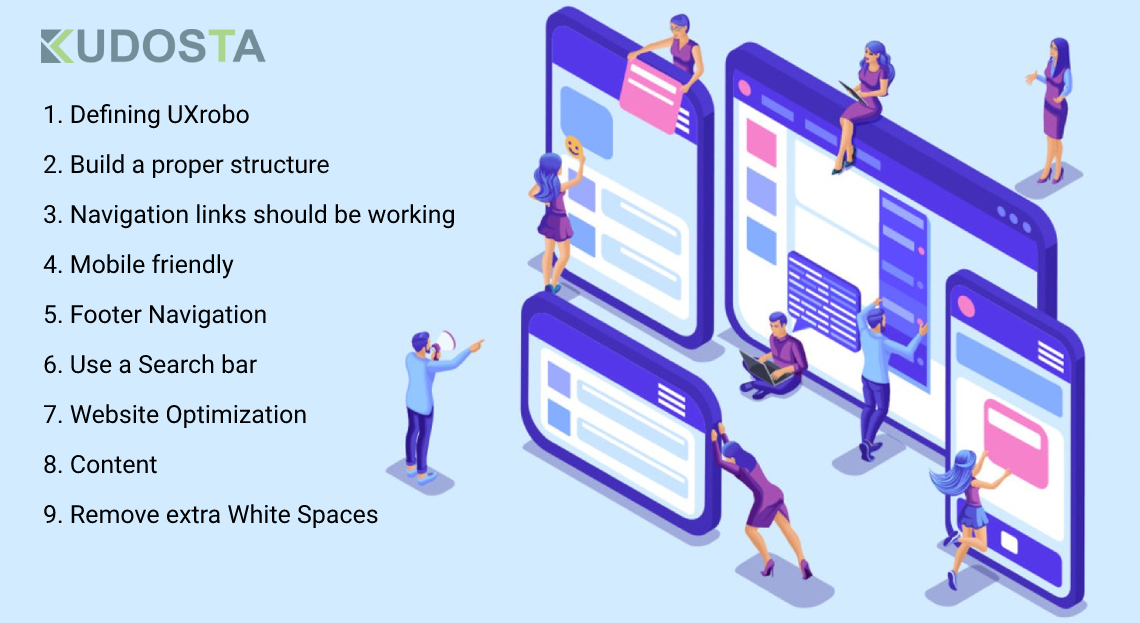
9 Proven Tips to Improve User Experience and Boost Organic Traffic on the Website
The first thing to understand is that your website has a PURPOSE. It is the "solution" for the visitors. You have to keep on updating it with the digital trends to attract more visitors. The simplest way is to track progress using analytics. If you can notice that your analytics is not giving you the expected data then there is a problem that you need to identify and resolve at the earliest.
Those lost impressions can reveal that your website is not responsive for mobile users or the content is not relevant as per their needs. On the other hand, slow loading pages and broken links of navigation can lead to poor Website Structure.
Do you want visitors to interact with your brand?
Focus on UX Improvements! Website is not just writing a piece of code, you need to give a lot more to generate ROI. Thus, to turn around the tables, you need to enhance the UX of your website.
Defining UX
User Experience (UX) means to provide relevant and meaningful information to users worldwide via your website. It means that you can't upload anything that is simply data. The content should be authoritative. UX is not limited to the website development process but it also works for converting website visitors into customers.
Tips for enhancing user's experience are as follows-
Build a proper structure
Developers should focus on constructing a reliable hierarchy to make scrolling convenient for the visitors. Putting up the layout and font style as per the user's requirements will make your website appealing. The website should be-
- Error-free
- Valuable
- Users can take action on it
- It should be user-friendly
Navigation links should be working properly
You have to understand that users are not a GPS who can track where your web page is taking them. You must provide them a path to connect to your website. If you want prospects to get converted into leads and then to customers, work in the internal links effectively. You can give several options to the users to stay on a page like-
- Call-to-action buttons
- Social media options
- Business portfolios
- Adding infographics on pages like home
In short, the user should be directed to another page because a user will not be going to spend the whole day surfing simply a web page.
Mobile friendly
Nowadays, users have mobile phones in their hands most of the time. For searching food, travel places, information on health, and anything; so your website should be mobile responsive. In this pandemic situation, people are using mobile devices for earning, learning, and managing a business.
Not only messaging but these are also used for video conferencing purposes. A report by Nytimes describes that mobile apps got more popularity than web applications from the past year 2020.
Footer Navigation
Designers and digital marketers should not forget that people access the whole website. If your footer links aren't working properly, then it will create an issue. But do not load it with too many buttons. You can add social media pages, contact info or if you have news for your visitors then it will be great.
Use a Search bar
This is the basic strategy that every developer use is to embed a search bar in the website. Believe that users don't spend their entire day on one website. To provide them the answers faster, you can use the "search bar". It will allow users to find whatever they want within fewer seconds. This enhancement will upgrade the credibility of your website.
Website Optimization
Whether your business is small or large, optimizing your website could uplift your brand online. Without optimization, your website might appear on the 2nd or 3rd page or more of SERP which is not a good sign. To rank on top, you need to make it usable for mobile and desktop users. A simple design with informative content linked with authoritative websites will surely work.
Content
Relevance should be a key that you must use to unlock consumer's conversion rates. Use visuals appropriately; these should be placed on a web page that is most frequently visited like a home or service page.
Another aspect is that users like to have pages that respond to them quickly when they click on a product or shopping cart. Therefore, you need to fix UX to get responses from the customers. Video is always a good thing to attract them.
Remove extra White Spaces
Margin is important to make the content appealing but it should not be harming a brand's reputation. Allow your website to breathe with white space. A well-defined header with a menu bar and call to action is the complete recipe you need to increase website traffic. If you find unwanted white space on the website, remove it immediately!
User Testing
The last step of improving UX is to test what you have built. You can share the website with fewer users so that they can check the features and functionality. These users can be your colleagues or someone from family. You can also add a feedback button on a web page to get genuine responses from the users.
Epilogue for the Blog
Analytics is a great way to understand what is happening over the website. Only building and launching it over the web should not be the case. Instead, you have to maintain it by optimizing it properly.
Your website is your front face, beautify it with these UX improvements and then watch the ever-increasing ROI of your brand. However, effective market research is one of the ways businesses can achieve success in generating leads.

