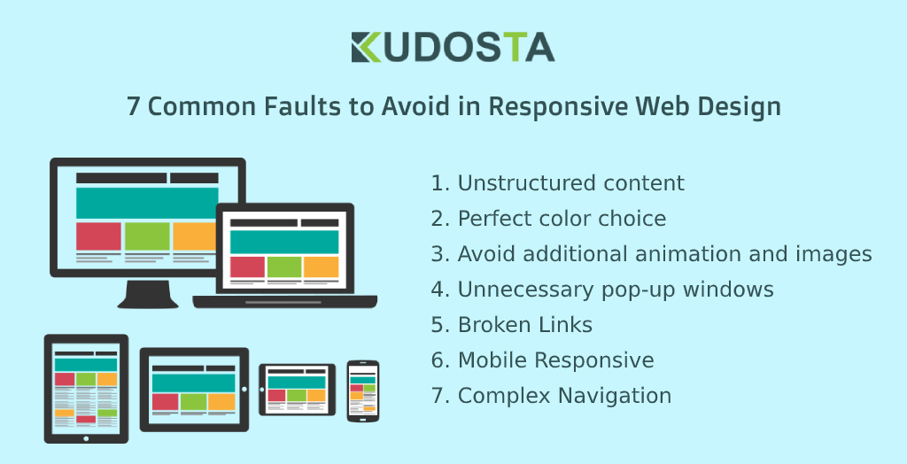
7 Common Faults to Avoid in Responsive Web Design
The digital world is changing drastically and dynamically in no time. In this case, if you are thinking of making your business boom on the online platform, then there are a few things that you need to remember.
Responsive web design is a key principle of any website to rank on the first page of the search engine. As a growing brand, you need to be very careful about every bit. In this digital world, the readability and user experience also matter.
1. Unstructured Content
Outer looks matter when it comes to website content because the visitors look at the first things. However, different companies require a different layout. It is important to have creativity and attractiveness, instead of a messy one. Make sure that captures the right eyeballs.
2. Perfect Color Choice
The viewers will get enticed only if you use the syndicate's right color combination for your website. The chrome combination that you use must be according to your industry and match your logo. The proficient designers will be an experts in perfectly playing with your color combination.
3. Avoid Additional Animation And Images
Business owners mostly think that people get attracted to animation, but not too much. It's recommended to use minimal images that impulse your text, however, not at the cost of website speed. The more animation you employ, the more time your website will take to load.
4. Unnecessary Pop-up Windows
Avoid imposing unnecessary pop-up windows, which will annoy your customers. Though the site owners use them to gain more traffic, it is crucial to use them smartly. Most importantly, keep the close option for your users if they are not interested.
5. Broken Links
If you are someone who is familiar with blogging and websites, then you must be aware of the importance of the links. The links are generally helpful in driving the visitors to the right track but use them strategically. Using the broken might be tricky, but deal with it smartly.
6. Mobile Responsive
Earlier, it was not essential to look for a mobile responsive website, but now ignoring that can ruin your business plan. As a designer, you need to ensure that the website works perfectly when you access it on your mobile. This is because most people access websites only using mobile phones.
7. Complex Navigation
Complicated navigation can upset your customer. Once a visitor is on our web page, they hardly take approx. 30 sec to take a glance at the entire page. In that case, if you have complex navigation, there is a higher chance that they will exit your website, even if your services are good.
Final Touch
Many designers in the notion of creating a creative website, end up designing a messy website. It is important that you don't repeat that message at any cost, as it can be a huge loss for you.
There is no such thing as such a thing called perfect design that could work for all types of client needs. The only secret is to analyze and achieve a responsive one for your valuable clients and serve the purpose.

